Tripaneer
I led the redesign of Tripaneer’s search experience to address decision paralysis caused by high content density and inconsistent filtering within an existing marketplace architecture.
Sole Designer
B2C
End-to End Design
Figma
Miro
Research
Notion
Travel Marketplace Platform
IA
Interaction Pattern
The Company
Tripaneer is a global travel company that curates meaningful trips, from yoga retreats and surf camps to culinary adventures, helping people explore the world in more intentional ways.
The Goal
The goal was to make Tripaneer’s diverse range of services more visible and accessible, making it easy for users to explore, switch between options, compare experiences, and ultimately book their ideal trip


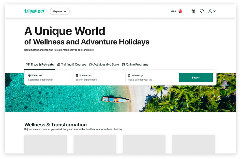
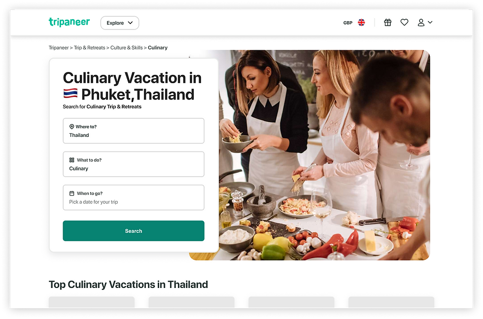
Final search bar designs following taxonomy updates and UI strategy for results, home, and landing pages.
56 %
Had trouble understanding the date picker
32%
Said Search fields triggered results too fast
49%
Said the field reccomendations were not verry hepful
Challenge
Make the user understand and Search from a diverse Supply

Observation
-
Users struggled to compare and select travel experiences due to fragmented filters, unclear category logic, and an overwhelming number of options. This resulted in slower decision-making and reduced confidence during search.
Requirement
-
Show the user that there are plenty of options available, all while keeping things simple and straightforward!
Constraints
-
Large, legacy content structure
-
Fixed backend filtering logic
-
Limited development time
Solution
"Contextual" Search Bar
Segmented the search experience into four core category pillars, improved UI interactions, added autocomplete and autosuggestion, and organized results into a clear, scalable hierarchy.


1.User needs
Let me Search
Maintain a sense of progress and control while browsing
Too many options
Quickly narrow options without losing relevant results
Guide me
Understand differences between similar experiences
2.Competitor Research - Intent Models
Competitor analysis showed that successful travel platforms prioritize intent-based entry points over exhaustive filtering. Users respond better when choice is structured progressively rather than presented all at once.

3.Feature Prioritisation
During a short workshop, generated a list of potential features and organized them based on urgency and importance,

4.Strategy - Time Constraints
Instead of expanding filtering options, I restructured search around intent-driven categories, allowing users to move from broad exploration to detailed filtering only when needed.
Steps 1–4 focus on maintaining momentum by delivering incremental improvements while technical limitations are being addressed.
Low-effort, lower-risk features are intentionally prioritized to optimize time, show visible progress, and refine the experience in parallel with backend restructuring.
The trade-off
Some high-impact changes are delayed, but overall progress continues without blocking on technical dependencies.

5.Information Architecture
The new structure prioritizes high-level intent categories before exposing detailed filters, reducing early cognitive load while preserving depth for advanced users.
This clarified how to integrate them into the search experience with core categories as main tabs,


6. Search with clarity
Search suggestions, visual cues, and contextual copy guide users toward relevant results without requiring precise input, supporting both exploratory and goal-driven behaviors.

7.Page Based Layout
I explored how the search bar adapts across pages, tailoring its structure and cues to the specific needs and user typologies that land on each page.

8.Context Aware Copy
Copy within each search bar section adapts to the active tab to reinforce context, guide user intent, and confirm their current choice.
This ensures users understand what they are searching for and why, while receiving immediate feedback aligned with the selected experience type.

9.Outcome
12%
Found out there are more services than initially thought
32%
Trust the results they get based on Search Bar interaction only
22%
Felt guided and assited during the search process...they don't feel lost anymore.
10.Before & After
The redesign shifted search from a flat, filter-heavy interface to a guided decision flow that supports exploration without overwhelming the user.
