GMA - Optimized decision-making
( App - Full Redesign Project Sample)
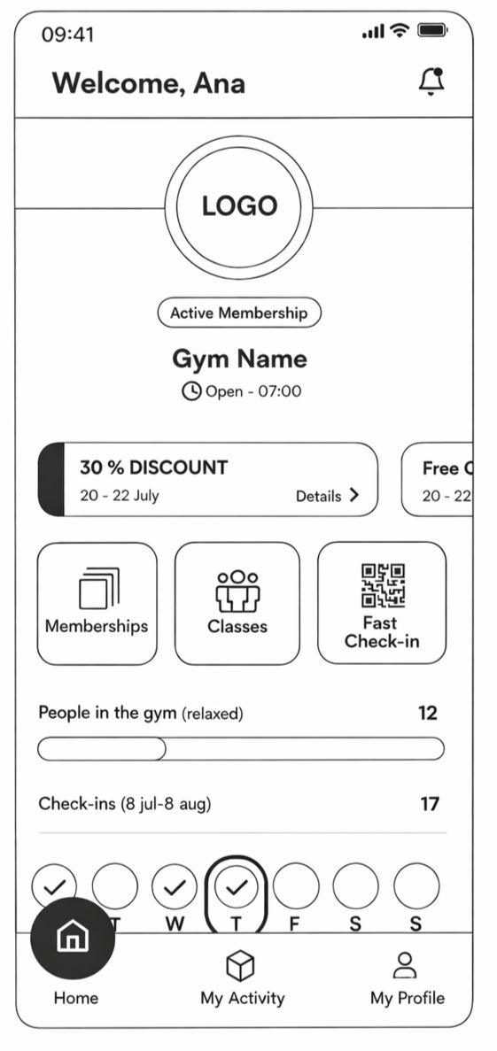
The goal was to redesign the GMA mobile app’s information architecture and UI to better support frequent member actions while aligning the experience with operational needs. The focus was on improving clarity, reducing friction in everyday tasks, and ensuring the app delivered clear, ongoing value beyond basic functionality.
SaaS
Sole Designer
B2B
End-to End Design
Figma
Miro
Research
Notion
Service Management Platform
IA
Interaction Pattern
Role: Product Designer
Scope: Reorganized home screen structure to prioritize key actions, reduce friction, and enable faster, clearer decision-making.
Timeline: 5-6 weeks
90%
were happy to benefit from new design and new features
78%
reported needing no guidance to use the app successfully
55%
said the main features upgrade brings more value

Challenge

Make the user understand and Search from a diverse Supply
Observation
-
Members struggled to identify the correct CTA for purchasing or upgrading memberships.
-
Access to gym attendance history and activity tracking was not immediately clear.
-
Frequent actions were buried among secondary options, slowing down routine interactions.
-
Important information lacked visual hierarchy, making the home screen feel overwhelming rather than supportive.
Requirement
-
The existing app interface made it difficult for members to quickly access common actions, such as checking in, viewing attendance history, or learning how to upgrade or purchase a membership. Key actions lacked clear CTAs, and important information was visually dense and poorly prioritized, increasing friction in everyday use.
Constraints
-
Core features and backend logic could not be altered.
-
The app needed to balance quick actions with informational content on the same screen.
Solution
Design by Priorities
I redesigned home screen around an action-first layout, making key CTAs for membership management, check-ins, and activity tracking immediately visible.
Clear visual grouping and hierarchy reduce scanning effort, while secondary information is organized to avoid distraction.
This approach improves task completion speed, reduces uncertainty, and increases the perceived value of the app in daily use.
User needs
Track progress
Members need clear visibility into their activity, including progress indicators and usage data, to understand how often they attend and how they are progressing over time.
Access attendance history
Members need a clear and structured view of their gym attendance history to review past activity and stay motivated.
Reduce interaction effort
Members need fewer boxes, clearer grouping, and less tapping to complete frequent actions, making everyday use faster and more intuitive.
Audit
The app home screen audit was conducted to evaluate how effectively the interface supports frequent member actions and surfaces critical information during everyday use. Early analysis showed that friction was not caused by missing features, but by unclear hierarchy, overloaded layouts, and insufficiently defined CTAs.

Strategic IA
I reorganized the layout by prioritizing the most needed and frequently used elements first, clearly separating primary information, primary actions, and secondary data.
This reduced redundancy, lowered cognitive load, and minimized the number of taps required to complete core actions.

Modular UI
I discovered an opportunity to build a modular design system enabling flexible app personalization, adapting colors, fonts, icons, and layouts for different businesses. Previously done on a smaller scale without design structure, personalization produced uneven results.
The new system brought consistency and scalability, helping the company attract bigger clients interested in premium, tailored app experiences.

Outcome
The redesign significantly improved usability, clarity, and user confidence across the app experience. By restructuring information, prioritizing high-value actions, and reducing interaction friction, users were able to understand features faster and navigate without guidance